
Color Theory and Palette Selection
Share
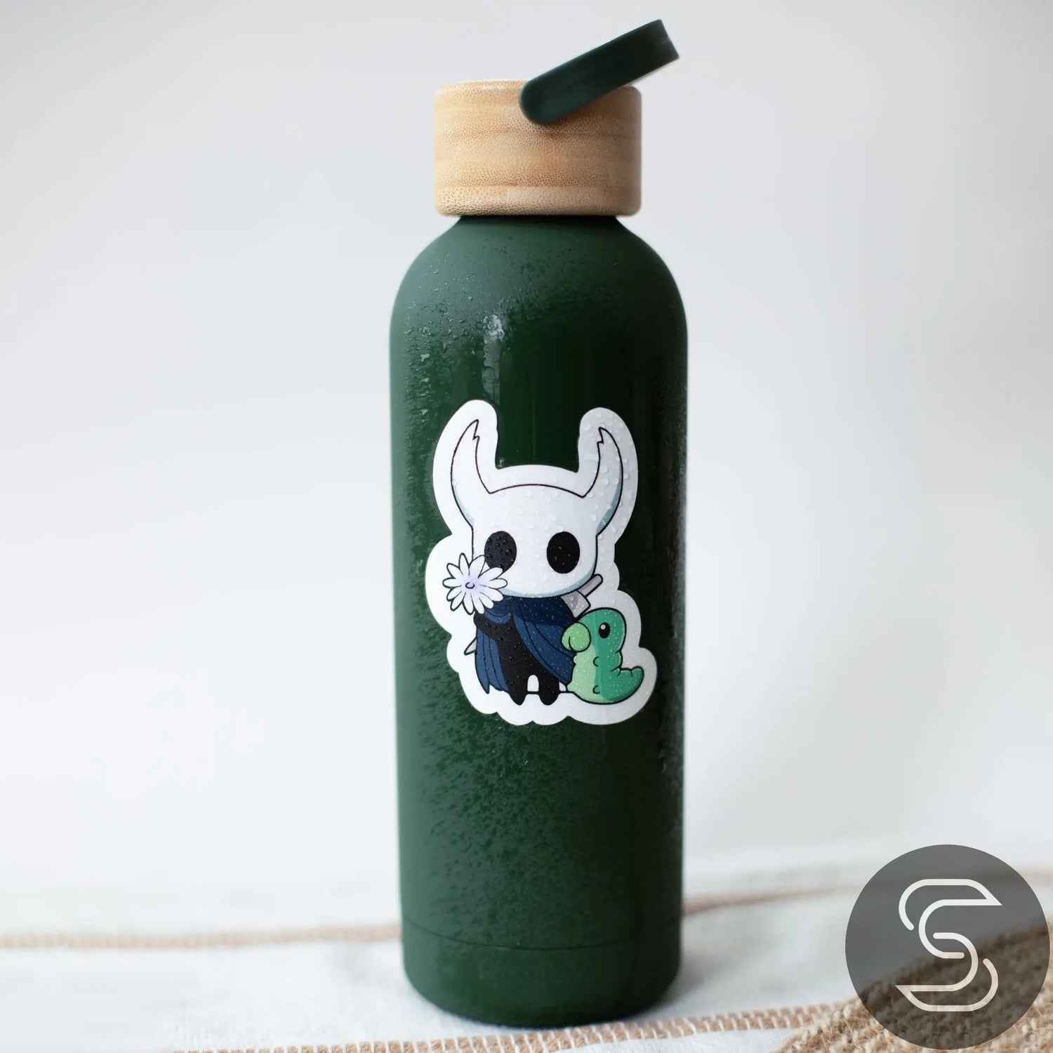
Welcome back to TheStickr’s series on creating outstanding stickers! In this post, we’ll explore color theory and palette selection, a vital aspect of sticker design that impacts both visual appeal and brand identity. Whether you’re a beginner or a seasoned designer, understanding how colors work together can transform your stickers from ordinary to unforgettable.
Why Color Matters
Color is often the first thing people notice about a sticker, and it sets the tone for everything else. A well-chosen color palette can:
- Convey Emotion: Colors influence mood and perception. For example, blue can evoke calmness, while red often signals energy or urgency.
- Enhance Brand Recognition: Consistent color usage helps you stand out and makes your stickers instantly recognizable.
- Create Visual Hierarchy: Strategic color contrasts highlight important elements in your design.
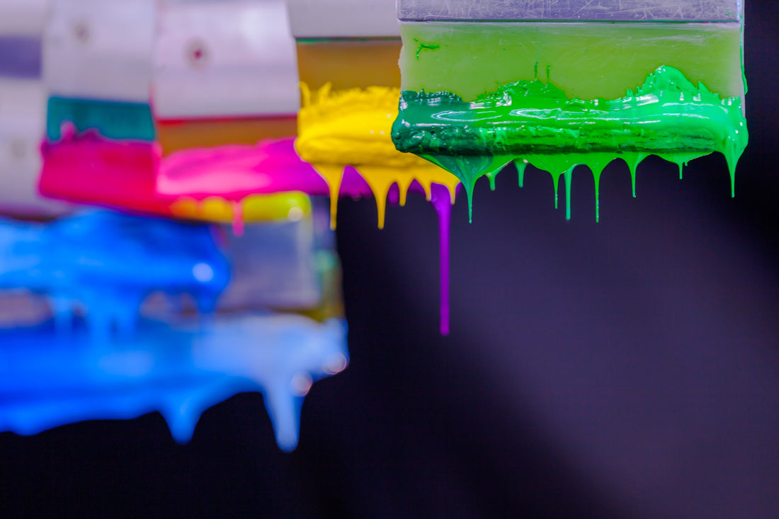
The Basics of Color Theory
Hue, Saturation, and Value
- Hue is the pure color (like red, blue, or yellow).
- Saturation describes how intense or vivid the color is.
-
Value refers to the lightness or darkness of a color.
Balancing these three factors is key for an appealing sticker design.
Color Wheel Fundamentals
- Complementary Colors: Opposite on the color wheel (e.g., red and green) for striking contrast.
- Analogous Colors: Next to each other (e.g., blue, blue-green, and green) for a harmonious look.
- Triadic Colors: Equally spaced around the wheel (e.g., red, yellow, and blue) for vibrant, balanced palettes.
Selecting the Perfect Palette
- Know Your Audience: If you’re designing for a playful children’s brand, bright primary colors might be ideal. For an upscale boutique, muted or pastel shades could be more appropriate.
- Limit Your Palette: Focusing on two or three main colors makes your sticker look cohesive. Add accent colors for highlights or text.
- Stay True to Your Brand: Consistency is crucial. If you already have brand colors, build your sticker palettes around them to maintain brand recognition.
Practical Tips & Tools
- Online Color Palettes: Websites like Adobe Color and Coolers provide ready-made palettes or allow you to create custom schemes.
- Test in Different Lighting: Print small samples and view them in various lighting conditions. Colors can shift based on light sources.
- Seek Feedback: Show your designs to friends or colleagues. Sometimes a second opinion helps spot color clashes you might miss.
Next Steps
Choosing the right colors is just one part of the sticker design equation. After you’ve locked in your palette, you’ll be ready to explore digital tools, file types, and exporting methods that bring your ideas to life. Stay tuned for our upcoming posts, where we’ll dive deeper into these technical details.
Connect With Us
We’d love to see the color palettes you’re experimenting with and hear your insights on color theory. Join the conversation on our social media channels or visit us at TheStickr.com for more tips on sticker creation.
Thanks for reading—and remember, the right color choices can make all the difference in turning your stickers into showstoppers!