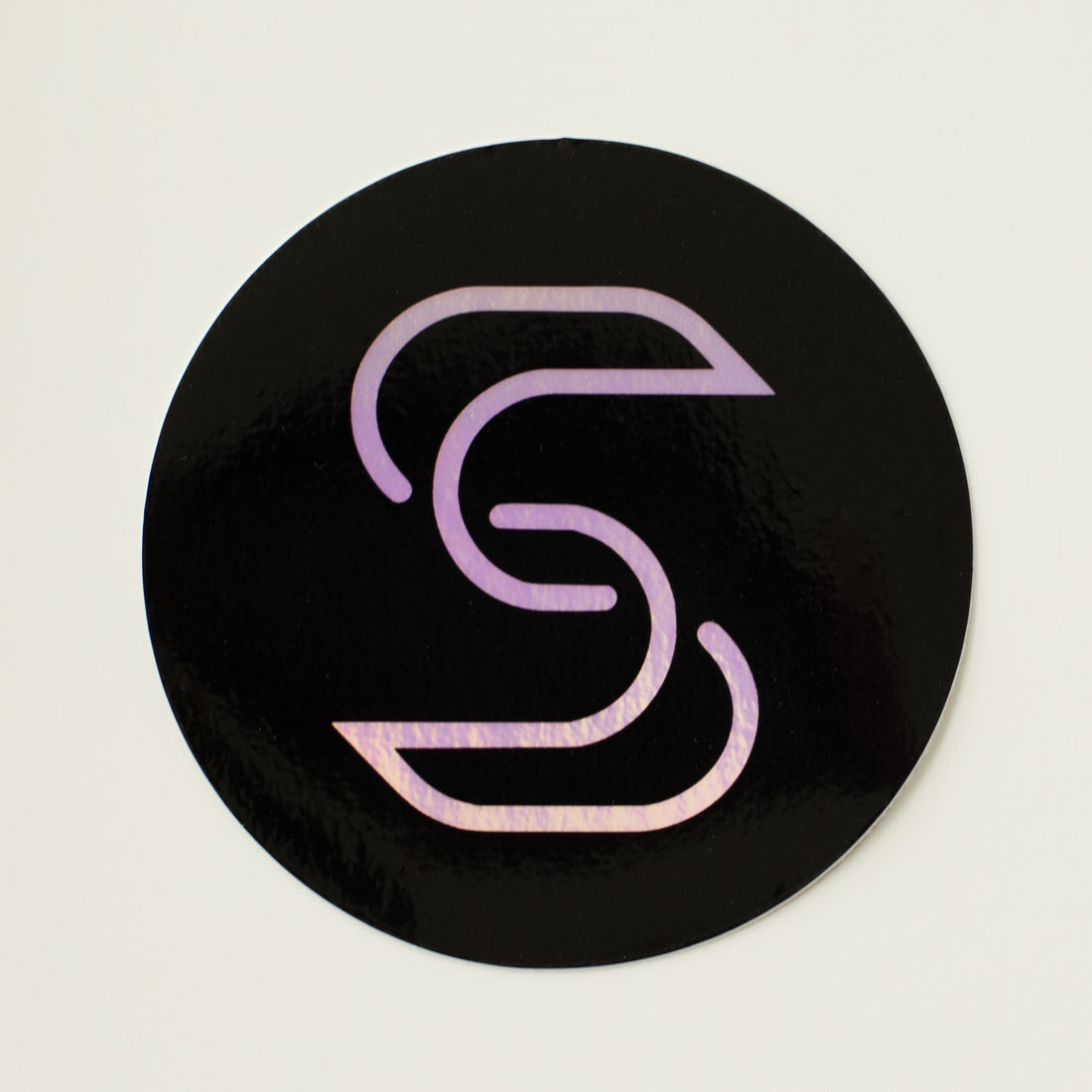
The Essence of Less
Share
In today’s fast-paced world, where consumers are inundated with countless messages daily, the art of minimalism in promotional sticker design emerges as a beacon of clarity and impact. This comprehensive guide delves deep into the minimalist design trend, illustrating how simplicity can not only elevate a brand's message but also forge a memorable connection with its audience. By embracing minimalism, brands can craft promotional stickers that are not just visually appealing but also strategically effective in conveying their essence.
The Philosophical Roots of Minimalism
Minimalism as a design philosophy is rooted in the idea that simplicity can enhance beauty and functionality. Originating from the minimalist art movement of the 1960s, which emphasized the use of simple forms and monochromatic palettes, this philosophy has permeated various design fields, including graphic design, product design, and, more recently, promotional materials like stickers.
Leveraging Simplicity for Maximum Impact
The minimalist approach to sticker design prioritizes simplicity to create impact. This involves:
- Strategic Use of Elements: Every component of the sticker, from shapes to colors and typography, is chosen for its ability to communicate effectively. This intentional simplicity ensures that the brand's message is the focal point, free from unnecessary embellishments that could dilute its impact.
- Memorability through Minimalism: Minimalist stickers are easy to remember because they stand out in a sea of over-designed alternatives. Their clean lines and uncluttered aesthetics capture attention and make the brand's message crystal clear to the audience.
Crafting a Bold Brand Statement
Minimalist stickers are not just promotional tools; they are declarations of a brand's identity. They reflect a brand’s commitment to clarity, quality, and focus, communicating a confident and refined image. Whether it's a luxury brand aiming to exude elegance or a startup advocating for sustainability, minimalist design speaks volumes about a brand’s values and vision.
Best Practices in Minimalist Sticker Design
To successfully implement minimalism in sticker design, consider the following practices:
- Identify the Core Message: Start by defining the key message you want to communicate. This clarity will guide the design process, ensuring that every element serves a purpose.
- Embrace Negative Space: Negative space is not merely background; it's an active element that shapes the design. Use it to highlight your focal point and create a visual hierarchy.
- Choose a Limited Color Palette: A restrained color scheme can convey your message more powerfully than a broad spectrum. Consider colors that align with your brand identity and the emotions you wish to evoke.
- Simplify Typography: Opt for clean, readable fonts that complement your design without overwhelming it. Sometimes, a single, impactful font is all you need to make your statement.
- Focus on Quality: With fewer elements in play, the quality of each becomes paramount. Choose high-quality materials for your stickers to ensure they reflect the excellence of your brand.
The Importance of Audience Engagement
Minimalist design does more than catch the eye; it invites the audience to engage with the brand on a deeper level. By presenting a clear and concise message, minimalist stickers encourage consumers to contemplate and interact with the brand, fostering a connection that goes beyond the visual.
Innovating within Minimalism
While minimalism emphasizes simplicity, it also encourages innovation. Brands can explore creative ways to express their message within the minimalist framework, experimenting with textures, materials, and subtle design elements that add depth and interest without sacrificing clarity.
Conclusion: The Lasting Impact of Minimalist Design
The minimalist trend in promotional sticker design represents a powerful approach to brand communication. By focusing on simplicity, brands can create promotional materials that not only stand out visually but also resonate deeply with their target audience. As we move forward, the principles of minimalism will continue to guide brands in crafting messages that are not only heard but felt, ensuring that their stickers leave a lasting impression.
In embracing minimalism, brands are not just adopting a design trend; they are choosing a path of clarity, impact, and engagement. This approach not only sets the stage for memorable brand experiences but also aligns with contemporary values of mindfulness and authenticity. As you embark on your minimalist design journey, remember that the essence of your brand is best conveyed not through complexity, but through the powerful simplicity of less.

